Thursday, 24 May 2012

Less is More


This is a card I made to take along to our monthly Saturday crafting group.  Earlier in the month Sandra had sent us a sketch challenge taken from the Less is More Challenge blog to see if any of us wanted to have a go as a group challenge just for fun.           


I decided to have a go even though I'm a more is more crafter and this was the result.  I think I would have got the shakes had it been stripped back even further.  Using the card blank as the back ground for the topper was too big a step so backing paper from the NitWit digital download Time for Tea collection was used as it had colour but was still subtle.  The papers and embellishments in this collection are lovely if you like lilac, lemon and green shades. It also features pansies which are one of my favourite flowers to use in crafting.

I'd recently been looking through ideas books which I'd bought for inspiration and found Embroidery Creations with Beads by Jantina Lanting and this is where the design for the beaded pansy topper came from.

It's not a topper to make if you're in a hurry but gives you a feeling of achievement when it's finished.  The frame for the beaded pansy was made using nestabilities classic squares and then it was matted on to another square of card.  To give the topper another frame I stitched around the edge of the backing paper.  

Purple card stock from W Enterprises, lilac satin ribbon from John Lewis, a few brads and a peel off sentiment were the other materials used.  Encore metallic purple ink was sponged around the scalloped edges of the card blank.

I'd like to enter this card in the following challenges
Scrapbook Sisters Challenge 85 - Squares
Creative Monday Challenge 8 - Stitching
Karen's Doodles Challenge 105 - Stitch It Up
Opus Gluei Challenge 131 - Sew What
Make It Monday - Anything Goes

Thanks for reading
Liz xx


Tuesday, 22 May 2012

The Three Bears


These are cards I've made for three grand-nieces.  I made this card for Jenna, another grand-niece, earlier this year and liked how it turned out so much that I've made the same one for the other little grand-nieces too.  It was Taylor's third birthday yesterday so her one is already away but the other two have their birthdays later in the year.  I just have to remember where I put them now and to post them on time.  Here's a closer view.


This is a view of the back.


This is a photo of little Taylor and by the look on her face I think she enjoyed her birthday party.
 
A list of what I used to make these cards can be found on this post.

I'd like to enter this card in the following challenges

Thanks for reading.
Liz xx

Friday, 18 May 2012

Penny Black Saturday Challenge Week 201 - In the Garden


This is my entry for the Penny Black Saturday Challenge this week where the theme is In the Garden.  The toppers were made using a little Penny Black stamp called Carnival which I've had for some time but have never got around to using.

On the three toppers going down diagonally from the top right corner I coloured the stamp using Stampin' up's stampin' write pens in Rich Razzleberry, Regal Rose, Melon Mambo and Old Olive and spritzed the stamp with water before stamping.  The other two toppers were second, third and fourth overlapped impressions after respritzing.  

The three matching toppers were cut out using plain square Nestabilities, the edges sponged with Melon Mambo ink and then they were matted on to scalloped squares in Rich Razzleberry and Old Olive cardstock.   Matching metallic thread was wrapped around the corners of the scalloped square to make a frame and green pearls added to the centres of the large flowers  

On the other two toppers the edges were distressed before being sponged with ink, they were matted onto Rich Razzleberry scalloped squares and little pink seed beads were stitched in the centres of the flowers.


Rich Razzleberry and Old Olive cardstock were used for the backing layers and the Happy Birthday paper was created on the computer.  The Happy Birthday sentiment was cut from this backing paper.  To finish it off  Stampin' up's Rich Razzleberry and Rose Red ribbons were added and Melon  Mambo ink was sponged around the scalloped edges of the base card .

I'd like to enter this card in the following challenges
Penny Black Saturday Challenge Week 201 - In the Garden
Make It Monday - Anything Goes
Delightful Challenges - Add Ribbon
Papertake Weekly Challenge - In the Garden
Crafty Ribbons Challenge - Flowers 
Paper Shelter Challenge 64 - Birthday Card with Sentiment
The Sisterhood of Crafters Challenge - May Flowers
Truly Scrumptious Challenge 80 - Anything Goes
I Brake for Challenges - I Brake for Florals
Cupcake Craft Challenge 192 - Birthday with no Designer Papers
Hooked on Craft Challenge 20 - Flowers

Thanks for reading
Liz xx

Wednesday, 16 May 2012

Kanban Steam Punk


This is the card I've made for my friend's son who turns twenty-five on Friday.  Iain works in Reading now but will be home to spend his birthday with his family in Daviot, Aberdeenshire.

The inspiration for this one came from the topper which is one of six toppers on a sheet called Cameo Clock Adventures from Kanban's Steam Punk collection.  As I usually do, I pulled out anything I had that would fit the theme and then worked out what I wanted to use.  The topper is framed using the Tim Holtz Alterations Sizzix die Weathered Clock and the layer underneath is embossed using the Cuttlebug Clockworks embossing folder.  The cogs in the corners and the pocket watch were cut using Quickutz dies.  On the back of the pocket watch I've used peel offs to spell out Iain and 2010 as if they had been engraved there for the occasion.


On the inside the personalised message was created on the computer and then the cogs stamp from Stampin' up's set Sense of Time was stamped around the edges with their Chocolate Chip ink.  Framed in the centre of the Weathered Clock die cut is a sentiment from the same stamp set and the handles from the clock were used to create corners.  Lots of little cogs were die cut to decorate the Happy Birthday panel and some of them were connected with brads and thread.  The grey distressed backing paper is also from Kanban and the Happy Birthday paper was created on the computer.  When using the other toppers from this sheet I'll use the wording Birthday Time rather than Happy Birthday.


These are the decorated panels on the reverse of the fold back.  On the left hand side the panel has been decorated with the Happy Birthday paper and clock hands from the Weathered Clock die and a Quickutz fasteners die.  On the right hand side a clock face stamp from the Stampin' up set was stamped and embossed with gold detail embossing powder.  To disguise the specks of embossing powder which were embossed where they shouldn't have been I used a gold metallic pen to spritz lightly over the panel. 

I really enjoyed making this card and will use up the other toppers in the same way.  I also bought the Cameo Clocks Ladies topper sheet and feel I could used the same layout for them perhaps with a few back feathers and gems here and there and also fitting in some of the stamps from Kanban's Jasper set which I got as a birthday present.

Today I've seen a posting on the Letraset blog by Debbi showing how to use metallic Promarkers to colour cogs.  I'll have to keep that in mind for next time.

I'd like to enter this card in the following challenges

Thanks for reading
Liz xx

Friday, 11 May 2012

Decorated Tag


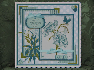
At our recent Saturday craft group meeting Sandra and Brenda brought along their collection of tags  which they had created by following the online Creative Chemistry 101 course by Tim Holtz.  It was inspiring to see the techniques they had covered and how they had put them to use on the tags.  Ink techniques is something I haven' t experimented much with and had, or did have, only one Tim Holtz ink pad and a few Glimmer Mists to play with but Sandra had brought along her stash and I started off making the tag which is the topper on this card.  

The tag was just an ordinary white luggage label I'd bought from Tesco so I'm not sure that the card quality was ideal but I'm happy with my first time results.  Three different colours of ink were used to colour the tag, which I can't remember the names of, before using Black Stazon ink to stamp the Inkadinkado Lady across the middle.  To add some sparkle I sprayed it with Turquoise Blue Glimmer Mist.  I'd liked how the colours had worked and when I got home decided to finish off the tag.  On the top right and bottom left corners the Hero Arts Stamp Style is Eternal was stamped to continue the script from the Inkadinkado stamp plus I felt it complimented the image. In the other corners I decided to add some pattern as a contrast and sponged ink through a cardboard mask I'd made using a paper punch to make spots.  I now feel this is a step I could have missed out. 


The colours of ink I'd used were a good match to Stampin' up's Pool Party, Indigo Island and Old Olive colours so I used their inks, card and ribbon for the layers on the card, to ink edges, colour the tag string and to make embellishments.  The stamped flowers were made using the Hero Arts/Sizzix stamp and die set Antique Flowers and Butterflies with Indigo Island ink being stamped on to Pool Party card.  Extra flowers were stamped and decoupaged on to the card and tag.  I also cut extra backing layers in coloured card to matt and layer the stamped flowers on to.  The little flowers were made using a Tonic punch.  The other backing papers were a floral patterned card from Kanban and the Happy Birthday paper which was created on the computer.  Stitching and paper pricking on cards used to be two of my favourite techniques but as with most techniques you go through phases and then move on to something different.  I've recently come back to using stitching to create frames for toppers and this is what I've done with the Happy Birthday paper.

This week I decided I'd buy a few more distress inks to continue experimenting but couldn't decide which colours to choose.  Unfortunately I've also had a cold and I had one of those nights where you are a feverish and have a recurring dream or thought.  My recurring thought was what colours of Tim Holtz distress ink pads should I choose.  In the cooler light of day I chose stormy sky, tumbled glass, pine needles and peeled paint which have arrived this morning.  I already had chipped sapphire so I'm hoping these will work together. 

As well as bringing along her stash for the group to use Sandra had made a selection of tags for us to choose one from to keep.  This is the one I chose. The second picture shows the lovely sheen it has when you catch it in a certain light.


Liz xx

Wednesday, 9 May 2012

Penny Black Saturday Challenge Week 200 - Case It


This is my entry to the Penny Black Saturday Challenge this week which is Case It and it's a card from Jenny which we are casing this month.  Here was Jenny's inspiration for us.


I took Jenny's layout, stamped image and baby theme as inspiration for my easel card.  Easel cards are lovely to make and give but it's difficult to photograph them to show them at their best.  Here are some more views of my card.


This card has been sent to a niece who gave birth to Rory Angus on the 22nd of April.  He was almost two weeks overdue and weighed in at 9lbs 31/2 ozs on his arrival which was quite timely as it was also his Mum's birthday.


The main image on the card is from the Penny Black stamp Baby Hammock and is coloured using Promarkers.  Nestabilities plain and scalloped circles were used to frame and back the image.  The spotted and gingham backing papers were from the Cuddly Buddly download - A Patchwork of Papers Blue, the It's a boy paper, baby boy verse and the message on the front of the card were created on the computer and the plain and pearlised card were from W Enterprises.  

To personalise the card for Rory I used Sizzix Sizzlits Chunkidelic Alphabet dies to cut the letters to spell his name and mounted them on to layers cut using Nestabilities Labels Four dies.  There is also a personal message from us on the back of the card which is mounted in the same way.

Instead of punching decorative corners I used a Quickutz die to cut out and attach corners and the Martha Stewart Lace Doily border punch was used to give the layered bands a decorative edge.  Peel off dots, blue satin ribbon from John Lewis and Bashful Blue ink from Stampin' up sponged around the edge of the scalloped base card were the final touches to this one.

I'd like to enter this card in the following challenges
Penny Black Saturday Challenge Week 200 - Case It
Diva's by design Challenge 34 - One for the Boy's
Everybody-Art-Challenge !92 - Baby
Papertake Weekly Challenge - Cute, Cute, Cute
Crafty Cardmakers Challenge 67 - For the Boys
The Crazy Challenge 118 - For a Young One
The Cutie Pie Challenge Blog Challenge 17 - Monochromatic
That Craft Place Challenge - One for the Boys
Sassy Cheryl's Challenge 114 - A Stitch in Time
Make It Monday - Anything Goes


Thanks for reading
Liz xx

Tuesday, 1 May 2012

Penny Black Saturday Challenge Week 199 - May Day


This is my entry to the Penny Black Saturday challenge this week which is May Day. It's an altered notebook which I made for my Mum as it's her birthday today.  She's a May Day birthday so it's appropriate that this challenge project is for her.  This also matches the card my family have given her for her birthday and it too was a PBSC entry which I've since tweaked to personalise it for her.


My Mum and her sister were in Aberdeen over the weekend so some intensive shopping and eating out was done.  I don't think I've been in and out of Aberdeen so many times for quite some time but when going along Queen's Road I couldn't help but notice all the cherry blossom in bloom at the moment.  The colours in these projects remind me of this.

The Penny Black image used on these is "you are the bestest" and was coloured using Promarkers.  The Gingham paper is from the Cuddly Buddly download A Patchwork of Papers Pink and the coloured card is Melon Mambo, Pretty in Pink, Certainly Celery and Old Olive from Stampin' up.  The bow is also in Pretty in Pink from Stampin' up.  The ribbons on the binding spring are nearly all odd bits or bows that went wrong.  It's a great way to use them up.  The image and the sentiment on the notebook were die cut using Labels Four Nestabilites dies.  The flowers were made using Tim Holtz Tattered Floral Sizzix die and a tonic small flower punch and the leaves were made using a Quickutz die.

The card I've given my Mum was also a Penny Black challenge card and used one of my favourite stamps at the moment.


We had a good weekend but I was absolutely shattered yesterday and good for nothing, not even some crafting.  Feeling more with it today and looking forward to our Crafting Bee this afternoon.  I have a baby card to make for the latest addition to the family so that will keep me busy.

Here's a photo of the three of us after our weekend of activities.  Mum, me and Esther.


I'd like to enter this card in the following challenges

Thanks for reading
Liz xx

Getting a bit Shirty


Back with another male card today, not through choice but necessity, but before continuing I'd like to thank those of you who have recently chosen to follow my blog. It's really encouraging that fellow crafters out there feel that your blog is worth keeping track of.

This is a quick and simple card I made for a grand-nephew who turns seventeen today and it's probably as near to making a clean and simple card as I get.  I really struggle with masculine cards but hopefully the subject of this one is neutral enough and appropriate to the age.

The shirt images were made using a stamp from Hampton Arts called Scattered Shirt.  Versafine majestic blue ink was used to stamp the images on to white card and on to the blue card it was stamped with Versamark ink and then embossed using white detail embossing powder and this gave positive and negative images to work with.  The shirts were die cut using a square Nestabilities die and then taped together to make a large topper.  I rotated the images so that it continued the scattered look.

The sentiment in the middle was made using a stamp from Hero Arts and majestic blue ink and then die cut and layered using plain and scalloped square Nestabilities dies.  Majestic blue ink was also used to sponge around the edge of the scalloped card.  The striped paper used in the backing layers came from the Papermania Burleigh Blue collection by Jesse Edwards.  This is a lovely collection of papers with designs suitable for both feminine and masculine projects.

A few crystal dot peel offs and Night of Navy ribbon from Stampin' up finished this one off.

I'd like to enter this card in the following challenges

Thanks for reading
Liz xx